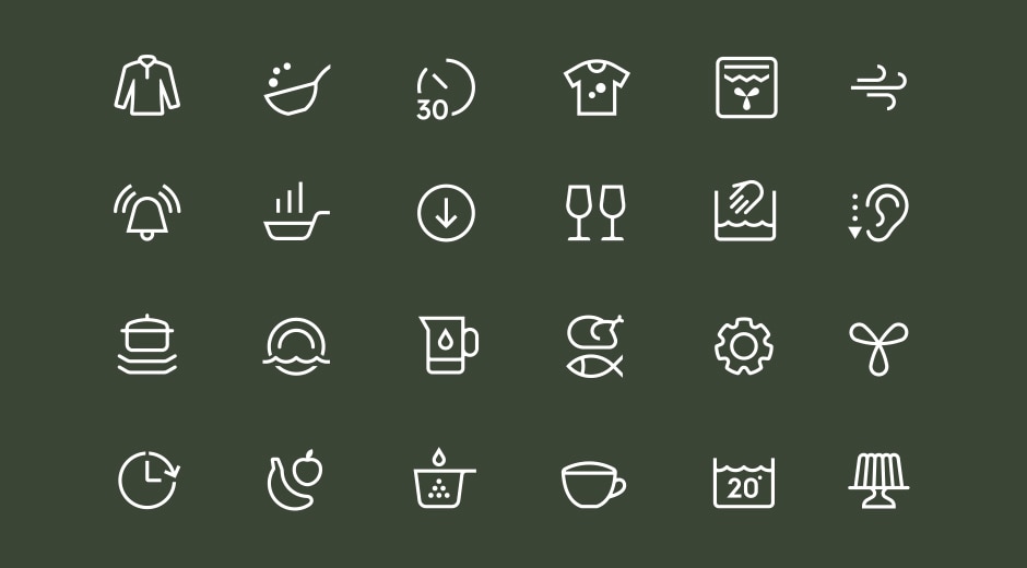
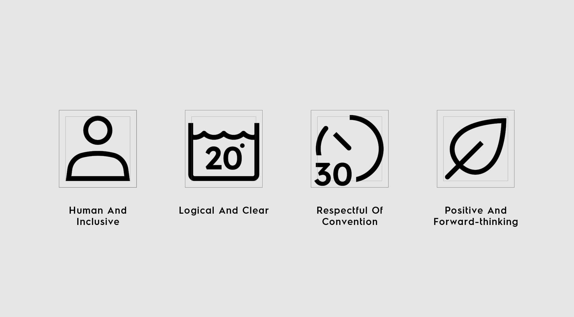
Consistent. Human. Intuitive. Our new set of icons follow these principles in order to deliver an outstanding consumer experience. After all, icons are the #1 way our consumers interact with our brands.
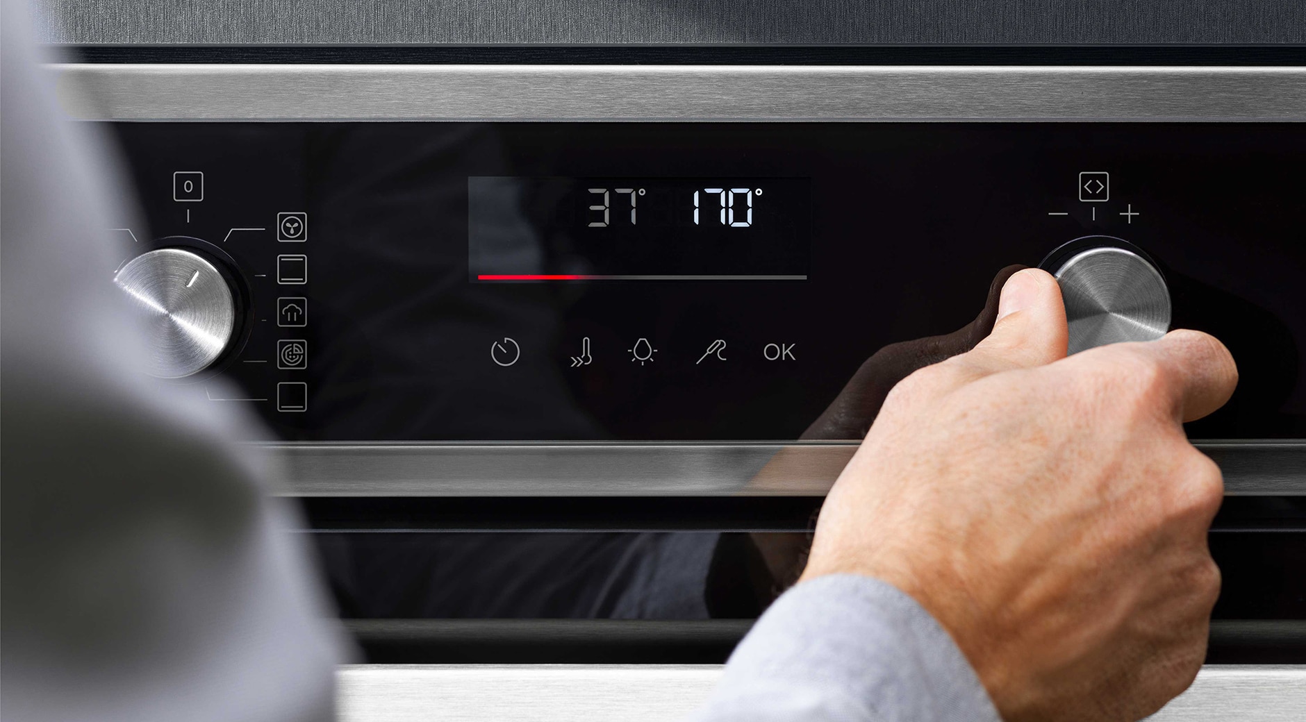
That’s why we’ve developed a unified icon library – a single set of symbols to support actions on our physical and digital touch points – appliance UI, web and mobile. The shapes form a system, so that consumers meet them again and again, across Electrolux Group products. They’re easily recognizable, cohesive, inclusive and… iconic!
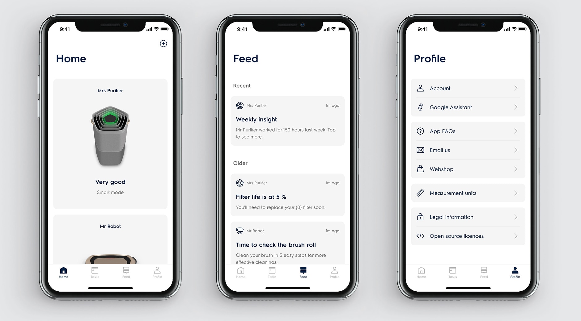
The team collaborated with renowned designer and iconographer Rob Bartlett, who has worked with Spotify, Net-A-Porter, and Nissan, to name a few. Rob has a socially progressive, representative, ethical and ecologically sensitive approach to design that resonates with the Electrolux Group’s main brands Electrolux, AEG and Frigidaire.
“We soon started thinking about our symbols as interactive extensions of the industrial designs, crafted with the same levels of care and attention to detail,” Rob says. “Collaborating with a team with a rich knowledge and respect for iconography enabled me to focus all my energies on crafting symbols that are inherently human from every angle and truly global in their reach.”
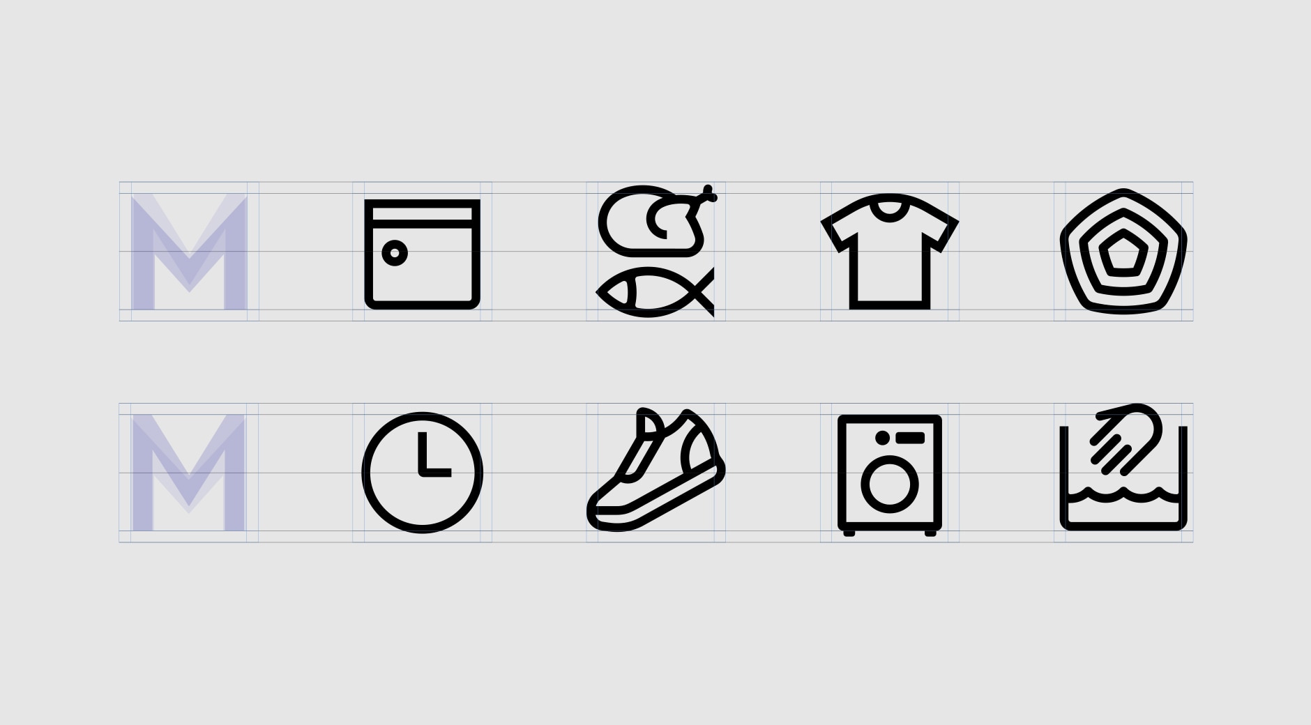
“Rob helped us challenge assumptions and provided perspective from a wider industry context,” says Alex Macleod, DX Design Director, Digital Product Organization.
“These small symbols need to be the best experience we can give to the user, whichever brand they interact with,” says Alissia Melka-Teichroew, Global Design Lead, Visual Design who led the project. “The goal was to reduce and rethink icons, not only to help us work more efficiently internally, but to enable consumers globally to recognize our brands, and enjoy the user experience.”
Now we have an always evolving set of icons that are more approachable and human, as well as distinctive and recognizable for consumers across the world.


